


A documentary about a typeface? For those of us who take interest in such things, of course! But if you're one of those who never bothers to change the default font in your Word documents from Times New Roman, then I'd recommend you stay away from this film altogether.
Unfortunately, even those who are keenly aware of typefaces may find this movie disappointing. My main criticisms:
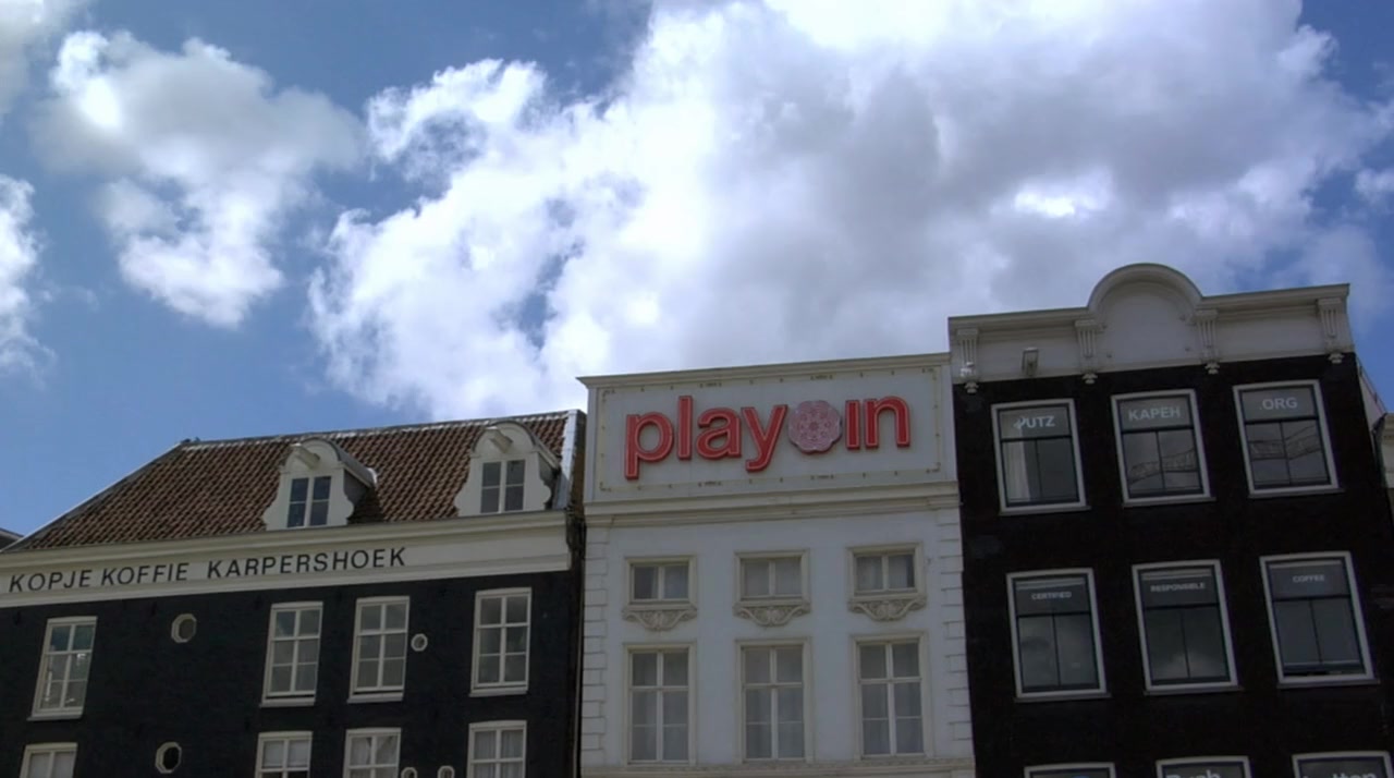
1. It spends long sequences showing us examples of Helvetica signage used in various contexts. Some are elegant and clean, many are torn old posters, ragged pieces of letters peeling off walls, etc. These sequences were artistic and okay at first, but maybe after the fourth one, you find yourself reaching for the fast-forward.
2. It spends the vast majority of its time in interviews with various designers discussing their impressions of the font's "meaning" or its impact in the history of design. This should have been perhaps 30% of the film, instead it is closer to 80%.
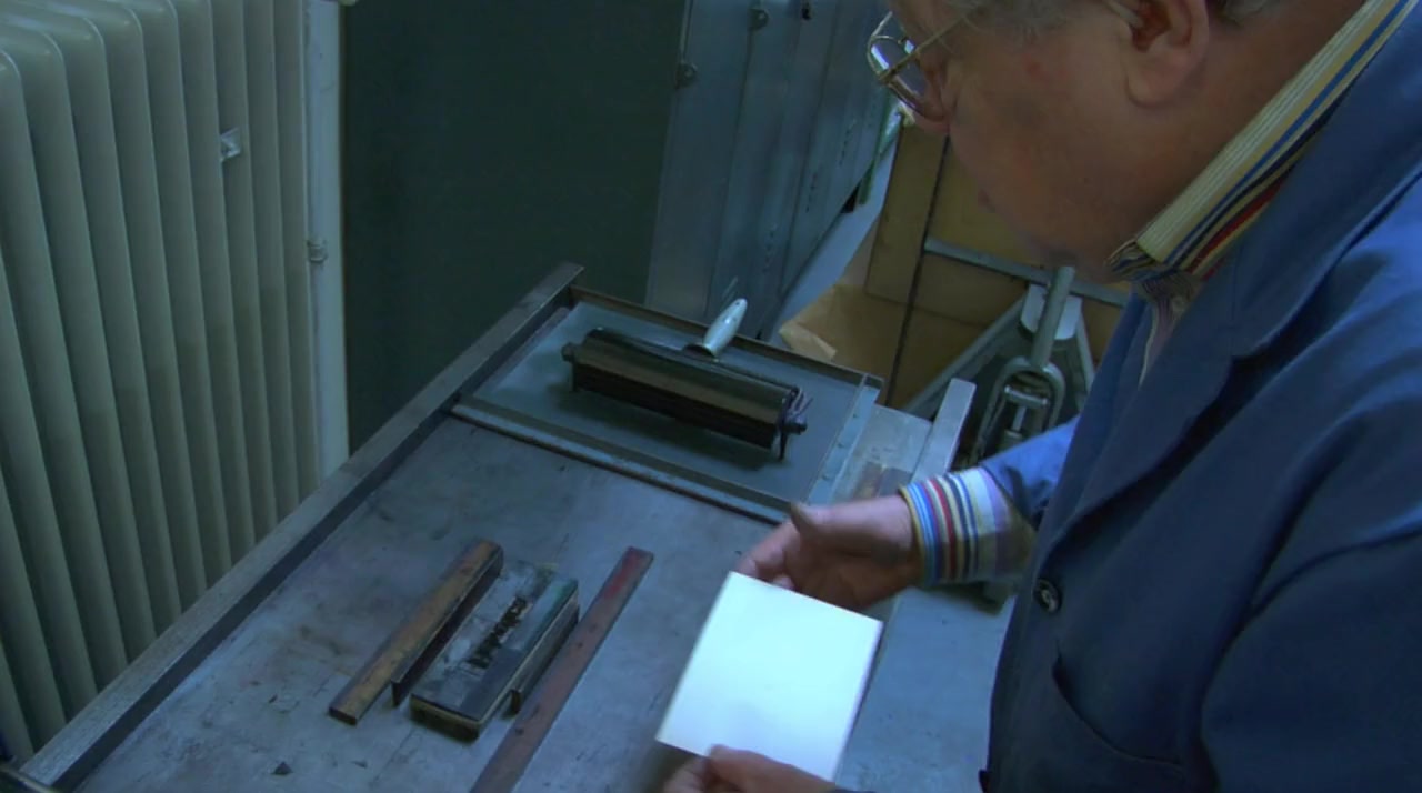
3. It doesn't spend enough time looking at the technical details of the font. There are occasional off-hand references by some of the interview subjects to various features of certain letters, but even those segments are not illustrated. I would have loved to see a side-by-side contrast between Helvetica and similar sans-serif fonts used earlier, or perhaps others created since then. In one sequence, we catch a glimpse of one of the original large-scale drawings for one of the letters; I would have enjoyed seeing more of those, larger on the screen, and with explanation of how the various parts work in relation to one another.
With its current affective emphasis, this would have been an acceptable 45-min. documentary, but at an hour and a half, it is far longer than it needs to be. I hoped to walk away with an understanding of what made Helvetica uniquely popular, but that was never clearly shown in any way.
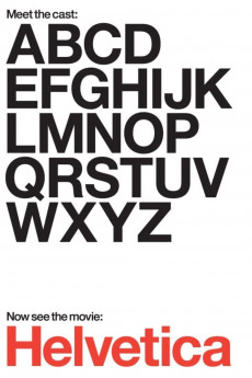
Helvetica
2007
Action / Documentary
Helvetica
2007
Action / Documentary
Plot summary
A documentary about typography, graphic design, and global visual culture.
Uploaded by: FREEMAN
Director
Top cast
Tech specs
720p.BLU 1080p.BLUMovie Reviews
Mildly interesting, but ponderous
Type is saying things to us all the time. Typefaces express a mood, an atmosphere. They give words a certain coloring.
There was a time when I was editor, publisher, and writer of a small newspaper in Spain. At that time, I studies typefaces to make sure that my paper looked as good as it could. In light of that I was interested in this documentary about the most popular typeface designed.
Helvetica has been around 50 years, and is the "default" type according to Erik Spiekermann, who really gives an exciting discussion of the type.
Many others chime in on the pros and cons of Helvetica. It is a fascinating journey into design. Exploring where we have been and where we are going in even the simple areas of life helps us understand who we are.
A Fascinating Look at What Could Be a Boring Topic
A documentary about typography (including but not limited to the Helvetica font),graphic design, and global visual culture.
So, you might wonder how 90 minutes about a font could be interesting. That must be among the most boring things in the world, right? Not at all. We learn about the whole story of modern typography, and how hard it used to be to design a single letter.
We learn that there is a political message to letter shape choices -- to one woman, Helvetica is the font associated with the Vietnam war (and also Iraq). We get a certain feeling from different shapes, and this is one of them.
One man asks, is there a science of aesthetics that explains why this font is the perfect one? Why no one has been able to improve on it in 50 years? I find that an interesting question. No math went into designing it, but somehow it has an intrinsic style that seems to be the way we now view language.